The Radio Card is a form element (radio input) with a bigger target area represented by a card container that allows users to select a single item from a list of related options.
Usage
Use the Radio Card Group in most cases. Use individual Radio Cards only in special cases and sparingly.
When to use
To allow users to select a single option from a group of two or more Radio Cards.
When a user could select multiple options, use a Checkbox
Control position
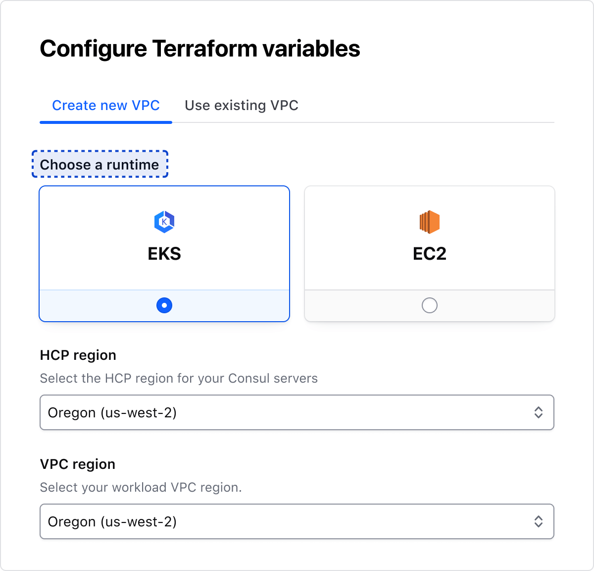
In most cases, we recommend using the bottom position. Still, we offer Radio Cards in a left position, which is a good option when the content in the cards is minimal.
Bottom
Left
Alignment
Left
Center
Layout
In most cases, use the horizontal layout to maximize the real estate available. Use the vertical layout intentionally when assembled with other components within limited horizontal space, or when needing to create a vertical options list with radio cards.
Horizontal
Vertical
Nested badge
Badges can be used in radio cards to display additional information and context. To ensure proper usage of the badge component, refer to the guidelines.
Legend
The legend is required to provide context for Radio Card's fieldset.
Error validation
For error validation recommendations, refer to the Form patterns documentation.
How to use this component
Form::RadioCard::Group creates:
a <fieldset> container
a <legend> element
a list of rendered <Form::RadioCard> components (with aria-describedby attributes automatically generated).
Consumer responsibility
The <Hds::Form::RadioCard::Group> component does not provide the logic for handling the mutually exclusive nature of radio controls (when a Radio Card is checked, any other Radio Cards with the same name that were previously checked become unchecked). You can implement this yourself in an {{on "change" this.onChange}} function or manage the checked state of Radio Cards by updating the underlying data.
The @name argument offers an easy way to provide the same name for all the radio controls with a single declaration.
<Hds::Form::RadioCard::Group @name="radio-card-basic-example" @alignment="center" as |G|>
  <G.Legend>Create connection</G.Legend>
    <G.RadioCard @checked={{true}} {{on "change" this.onChange}} as |R|>
      <R.Icon @name="aws-color" />
      <R.Label>Quick peering with Quick Links</R.Label>
      <R.Badge @text="2-5 min" />
      <R.Description>Quick peering with quick links will provide the fastest way to connect to your providers’ network.</R.Description>
    </G.RadioCard>
    <G.RadioCard {{on "change" this.onChange}} as |R|>
      <R.Icon @name="aws-color" />
      <R.Label>Manual peering using AWS CLI</R.Label>
      <R.Badge @text="5-10 min" />
      <R.Description>Provide you AWS CLI template to apply connection settings.</R.Description>
    </G.RadioCard>
    <G.RadioCard {{on "change" this.onChange}} as |R|>
      <R.Icon @name="hcp" />
      <R.Label>Manual peering using HCP and AWS web console</R.Label>
      <R.Badge @text="30-60 min" />
      <R.Description>Manually follow UI instructions to complete configuring a connection at provider side.</R.Description>
    </G.RadioCard>
</Hds::Form::RadioCard::Group>
Custom content
Customizable options include:
Defining custom content using the Generic block
Defining a custom width using the maxWidth argument
The Radio Card is a form element (radio input) with a bigger target area represented by a card container that allows users to select a single item from a list of related options.
Usage
Use the Radio Card Group in most cases. Use individual Radio Cards only in special cases and sparingly.
When to use
To allow users to select a single option from a group of two or more Radio Cards.
When a user could select multiple options, use a Checkbox
Control position
In most cases, we recommend using the bottom position. Still, we offer Radio Cards in a left position, which is a good option when the content in the cards is minimal.
Bottom
Left
Alignment
Left
Center
Layout
In most cases, use the horizontal layout to maximize the real estate available. Use the vertical layout intentionally when assembled with other components within limited horizontal space, or when needing to create a vertical options list with radio cards.
Horizontal
Vertical
Nested badge
Badges can be used in radio cards to display additional information and context. To ensure proper usage of the badge component, refer to the guidelines.
Legend
The legend is required to provide context for Radio Card's fieldset.
Error validation
For error validation recommendations, refer to the Form patterns documentation.
How to use this component
Form::RadioCard::Group creates:
a <fieldset> container
a <legend> element
a list of rendered <Form::RadioCard> components (with aria-describedby attributes automatically generated).
Consumer responsibility
The <Hds::Form::RadioCard::Group> component does not provide the logic for handling the mutually exclusive nature of radio controls (when a Radio Card is checked, any other Radio Cards with the same name that were previously checked become unchecked). You can implement this yourself in an {{on "change" this.onChange}} function or manage the checked state of Radio Cards by updating the underlying data.
The @name argument offers an easy way to provide the same name for all the radio controls with a single declaration.
<Hds::Form::RadioCard::Group @name="radio-card-basic-example" @alignment="center" as |G|>
  <G.Legend>Create connection</G.Legend>
    <G.RadioCard @checked={{true}} {{on "change" this.onChange}} as |R|>
      <R.Icon @name="aws-color" />
      <R.Label>Quick peering with Quick Links</R.Label>
      <R.Badge @text="2-5 min" />
      <R.Description>Quick peering with quick links will provide the fastest way to connect to your providers’ network.</R.Description>
    </G.RadioCard>
    <G.RadioCard {{on "change" this.onChange}} as |R|>
      <R.Icon @name="aws-color" />
      <R.Label>Manual peering using AWS CLI</R.Label>
      <R.Badge @text="5-10 min" />
      <R.Description>Provide you AWS CLI template to apply connection settings.</R.Description>
    </G.RadioCard>
    <G.RadioCard {{on "change" this.onChange}} as |R|>
      <R.Icon @name="hcp" />
      <R.Label>Manual peering using HCP and AWS web console</R.Label>
      <R.Badge @text="30-60 min" />
      <R.Description>Manually follow UI instructions to complete configuring a connection at provider side.</R.Description>
    </G.RadioCard>
</Hds::Form::RadioCard::Group>
Custom content
Customizable options include:
Defining custom content using the Generic block
Defining a custom width using the maxWidth argument