The Super Select component provides a way to select among a group of options and can be considered an enhanced version of the Select component. It supports rich content within option items, as well as custom content before and after the option items. The Super Select is built on top of ember-power-select.
Usage
When to use
- When the list of options is large and search is required to help filter the list.
- When complex, structured content is required to be displayed within the options.
When not to use
- To display a list of links (or buttons) in a menu, consider the Dropdown component instead.
- When a simple select is needed for a form, consider the Select form component.
- As a means to filter an array of objects within a data set; e.g., when presented in a tabular format or list. Instead, consider other filtering patterns.
Components
Single
Selection is limited to a single option item.
Multiple
Multiple options can be selected.

Trigger value states
Empty
The trigger is empty by default, indicating that nothing is selected.

Placeholder text
Placeholder text can be added to the trigger to provide the user additional context. However, this information should not be required for them to carry out a task.

Filled
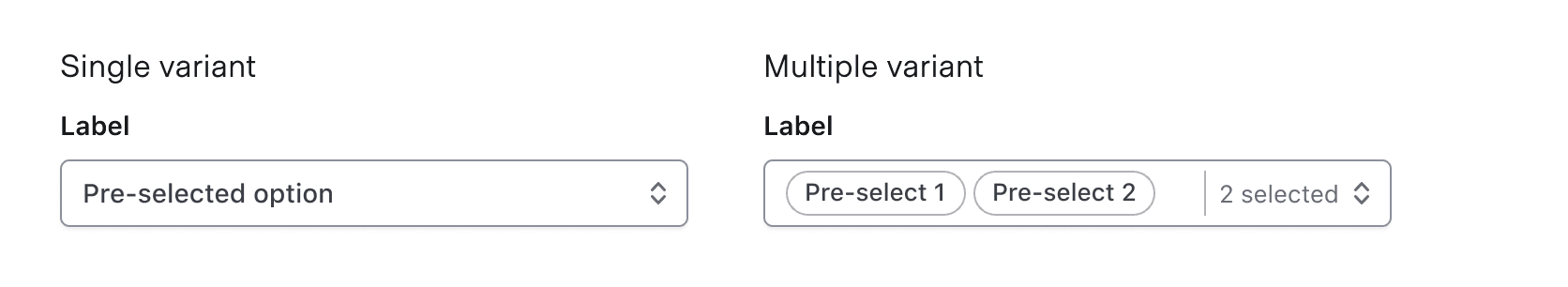
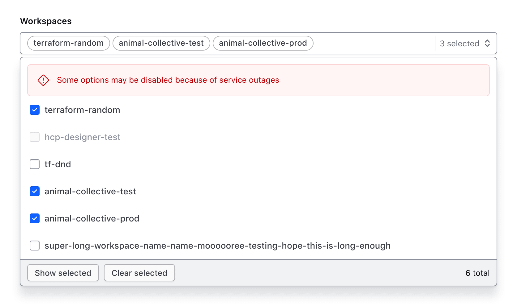
When one or more values are selected, the trigger is populated with the selected value(s). One or more values can be pre-selected before user interaction as needed. It is important to note that the selected values in the trigger are displayed in the order chosen by the user.
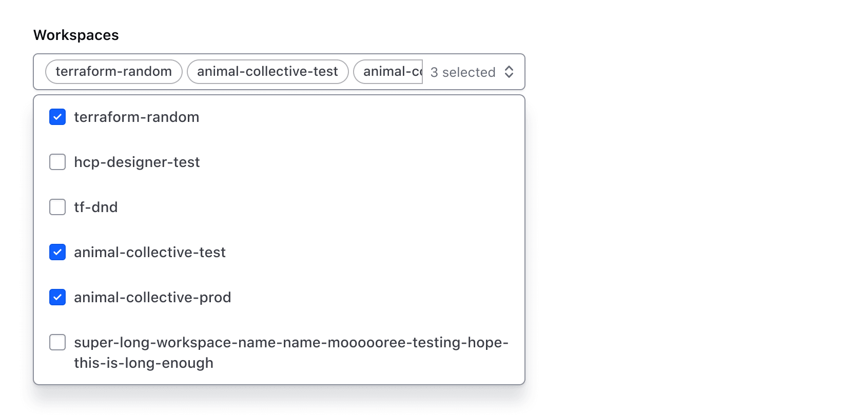
In the SuperSelect Multiple component, a count of the number of selected items displays when one or more selections have been made.
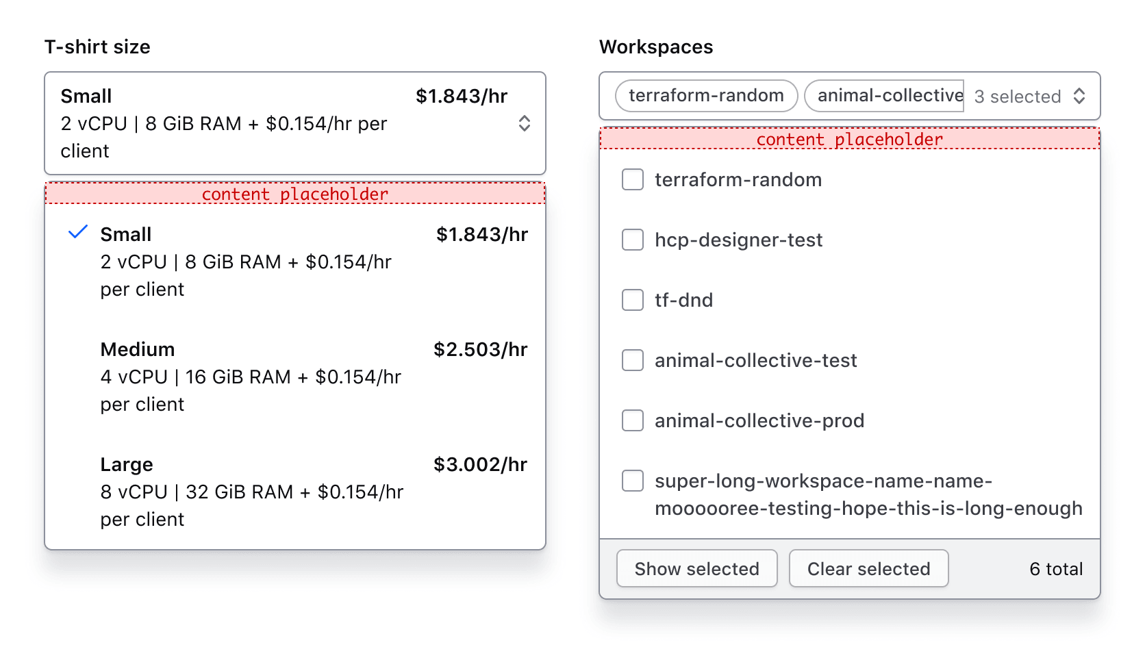
Before and after options
The before and after options are areas above and below the list, independent from the list of options. Predefined components (like search) or generic content can occupy these spaces.
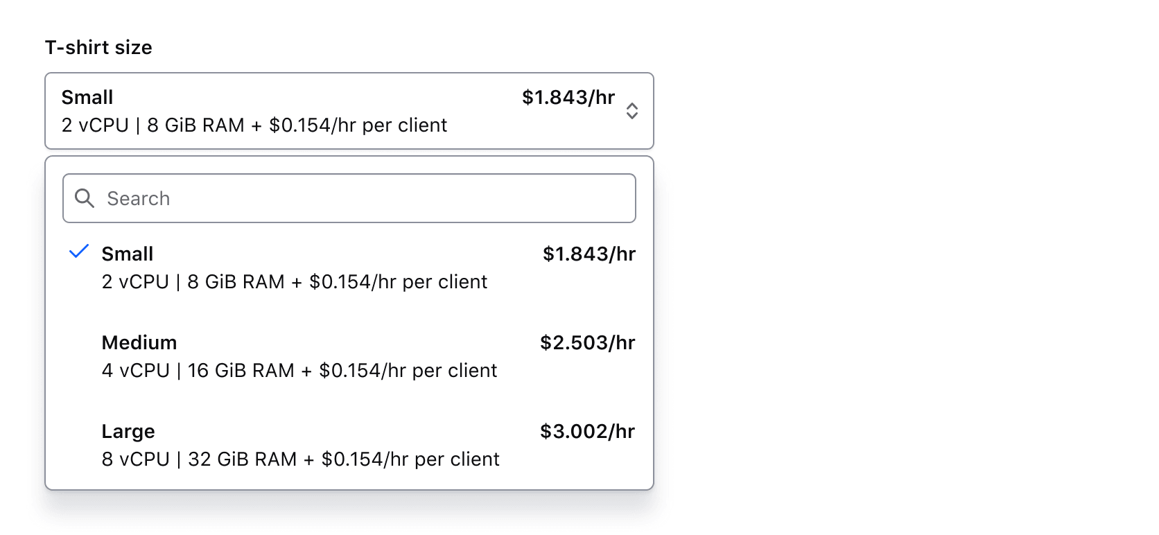
BeforeOptions
BeforeOptions allows for either a search field or generic content to be displayed before the options list.
Search
If enabled, search allows the user to filter results based on a query.
Generic content
If enabled, generic content will occupy this space.
We recommend against placing heavy UI elements in custom content as it can draw attention away from the list options and will only be visible when the menu is open. Consider placing such content outside the list relative to the trigger for better visibility.
AfterOptions
AfterOptions allows for either a standardized footer or generic content to be displayed after the options list. The footer has additional functionality in the Multiple component compared to the Single.
Footer
By default, the footer displays below the options list and contains content and/or buttons which provide additional context or functions related to the options.
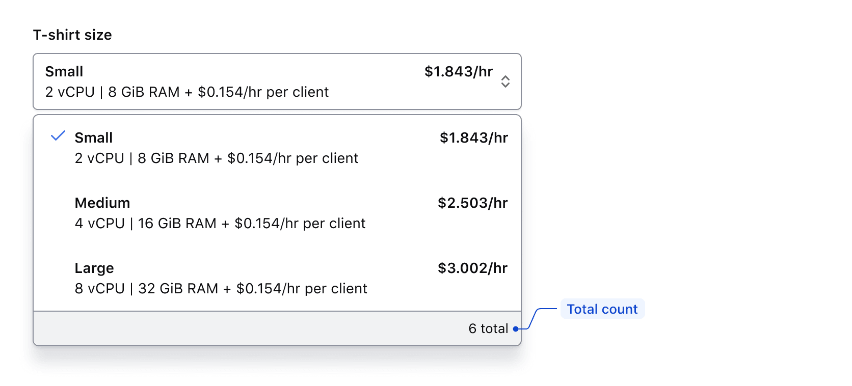
Single
The footer for the Single component includes a total count, which is customizable to fit the context. However, we recommend using "{xx} total" to maintain consistency across products.
Multiple
The footer for the Multiple component includes a total count and list modifier buttons. While the count text can be customized, we recommend using "{xx} total" to drive consistency across products.

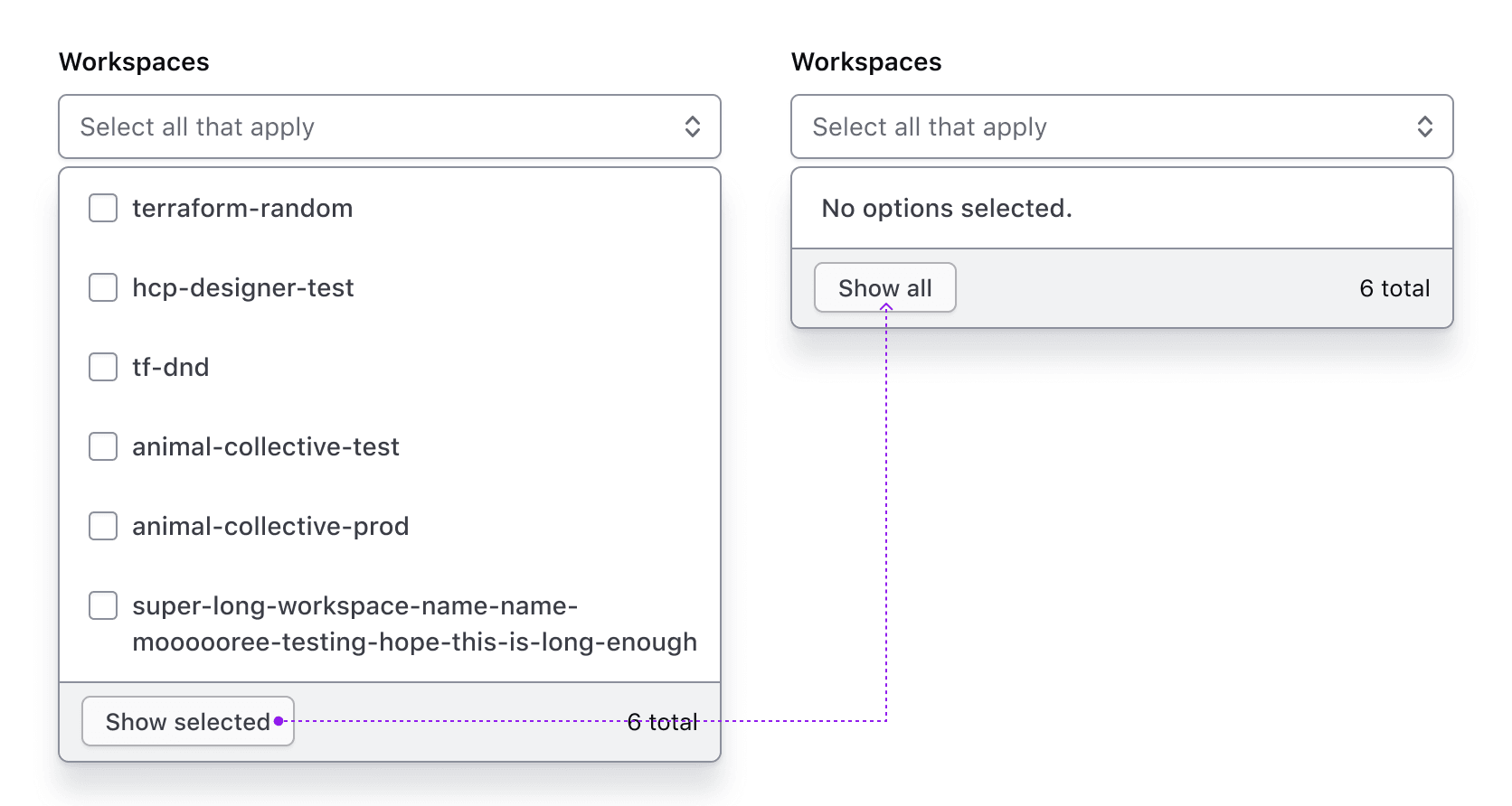
The “Show selected” button displays only the selected options in the list. When toggled, the text changes to “Show all.”

If “Show selected” is toggled when no options have been selected, a message will appear notifying the user.
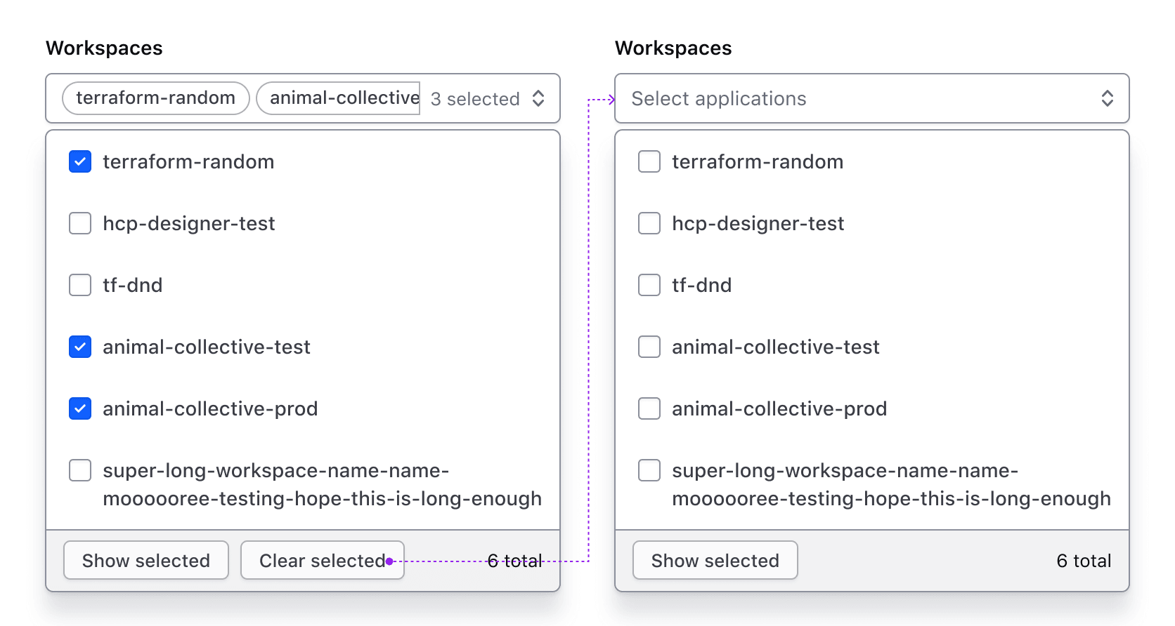
The “Clear selected” button clears all selections and reverts the Super Select to its default/deselected state. This button is hidden if no options are selected.
Footer with generic content
The footer can contain generic content instead of the default content. This is helpful in maintaining the standard appearance of the footer container while allowing for custom usage.
Generic content
If enabled, generic content will occupy this space.
List
Positioning
Lists can be positioned to the left or right, as well as above or below the trigger as necessary to fit within the UI. These options are only available when matchTriggerWidth is set to false. This effects the ember component only.

Width
By default, the width of the list matches the trigger width.
Auto width
If the list width is set to “auto" it will match the width of the longest list item, which may result in the list being narrower or wider than the trigger width. A max-width can also be defined for the list.

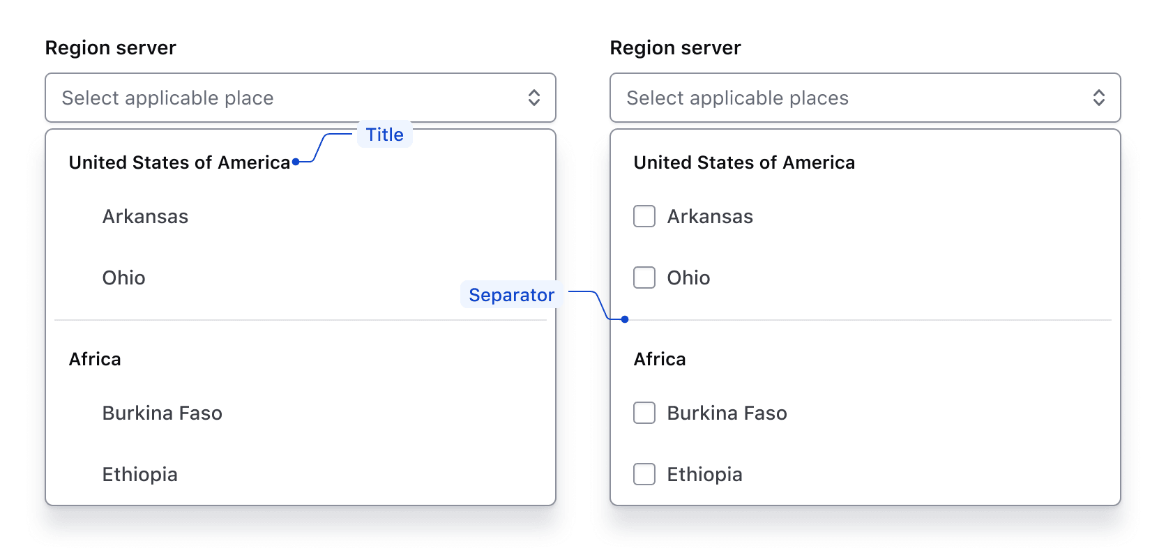
ListItem Types
There are four types of ListItems, two of which are component-specific.
Checkmarkis used in the Single component to indicate a selection has been made.Checkboxis used in the Multiple component to indicate that more than one option can be selected.Titleis used to group ListItems together and help visually organize groups.Separatoris used to create a visual separation between groups.

Groups
ListItems can be grouped visually by adding a title and a separator. The last group in the list doesn’t require a separator.
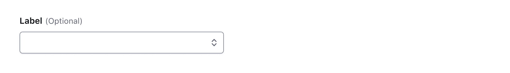
Required and optional
For complex forms, required fields should be indicated. This is the most explicit and transparent method to ensure users don’t have to make assumptions. Read more about best practices for marking required fields in forms.
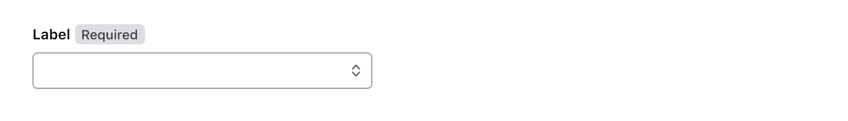
For shorter, simpler forms (e.g., login/signup and feedback requests), indicate optional fields instead.
Error validation
For error validation recommendations, refer to the Form patterns documentation.
How to use this component
Super Select is a custom select-like component aiming to overcome some limitations of the HTML <select> element.
It’s primarily a wrapper for ember-power-select and uses the 8.2.0 version with specific accessibility and styling choices that best fit our design system.
We provide two main components with similar APIs: Form::SuperSelect::Single and Form::SuperSelect::Multiple.
There are two ways to use each of the Super Select component types:
Form::SuperSelect::Single::BaseorForm::SuperSelect::Multiple::Base—the base component with just the Super Select control. In these instances, you will need to add your own label, helper text, and error messaging.Form::SuperSelect::Single::FieldorForm::SuperSelect::Multiple::Field—the field parent component which includes the Super Select control, label, helper text, and error messaging (in a wrapping container).
We recommend using the Field variation as it provides built-in accessibility functionality. Use the Base variation for custom layouts or special use cases not otherwise covered.
Form::SuperSelect::Single
In cases where the Dropdown or Form Select components are not suitable, use SuperSelect::Single.
<Hds::Form::SuperSelect::Single::Field
  @onChange={{fn (mut this.SELECTED_OPTION)}}
  @selected={{this.SELECTED_OPTION}}
  @options={{this.OPTIONS}}
  @searchEnabled={{true}}
  as |F|
>
  <F.Label>This is the label</F.Label>
  <F.Options>{{F.options}}</F.Options>
</Hds::Form::SuperSelect::Single::Field>
Form::SuperSelect::Multiple
Use SuperSelect::Multiple to allow users to select multiple options.
<Hds::Form::SuperSelect::Multiple::Field
  @onChange={{fn (mut this.SELECTED_OPTIONS)}}
  @selected={{this.SELECTED_OPTIONS}}
  @options={{this.OPTIONS}}
  @searchEnabled={{true}}
  as |F|
>
  <F.Label>This is the label</F.Label>
  <F.Options>{{F.options}}</F.Options>
</Hds::Form::SuperSelect::Multiple::Field>
Pre-selected options
To pre-select an option, declare a value for the selected argument:
<Hds::Form::SuperSelect::Single::Field
  @onChange={{fn (mut this.PRE_SELECTED_OPTION)}}
  @selected={{this.PRE_SELECTED_OPTION}}
  @options={{this.OPTIONS}}
  @searchEnabled={{true}}
  as |F|
>
  <F.Label>Label</F.Label>
  <F.Options>{{F.options}}</F.Options>
</Hds::Form::SuperSelect::Single::Field>
Placeholder
Placeholder text can be added to provide additional context. However, this information should not be necessary for users to complete a task.
<Hds::Form::SuperSelect::Single::Field
  @onChange={{fn (mut this.PLACEHOLDER_SELECTED_OPTION)}}
  @selected={{this.PLACEHOLDER_SELECTED_OPTION}}
  @options={{this.OPTIONS}}
  @searchEnabled={{true}}
  @placeholder="Your location"
  as |F|
>
  <F.Label>Select your location of residence</F.Label>
  <F.Options>{{F.options}}</F.Options>
</Hds::Form::SuperSelect::Single::Field>
Grouped options
To group similar sets of options, pass a nested data structure specifying the groupName and associated options.
Nested data structure example:
[
  { groupName: 'Most common', options: ['Kubernetes', 'AWS'] },
  { groupName: 'Others', options: ['CloudWise', 'SWA', 'Other'] },
]
Component invocation:
<Hds::Form::SuperSelect::Multiple::Field
  @onChange={{fn (mut this.SELECTED_GROUPED_OPTIONS)}}
  @selected={{this.SELECTED_GROUPED_OPTIONS}}
  @options={{this.GROUPED_OPTIONS}}
  as |F|
>
  <F.Label>Grouped options</F.Label>
  <F.Options>{{F.options}}</F.Options>
</Hds::Form::SuperSelect::Multiple::Field>
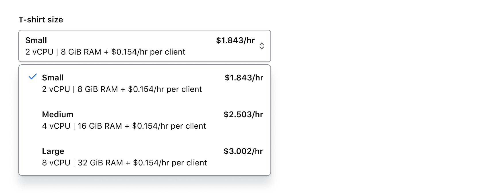
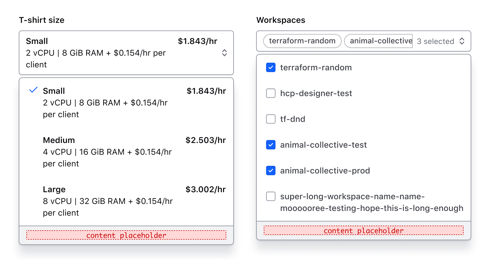
Rich-content options
Super Select allows you to add HTML tags within options to lay out and structure content vs. Hds::FormSelect which only allows plain text strings as option content.
Rich content with default display in SuperSelect::Single
<Hds::Form::SuperSelect::Single::Field
  @onChange={{fn (mut this.SELECTED_CLUSTER_SIZE_OPTION)}}
  @selected={{this.SELECTED_CLUSTER_SIZE_OPTION}}
  @options={{this.CLUSTER_SIZE_OPTIONS}}
  as |F|
>
  <F.Label>Size</F.Label>
  <F.Options>
    {{#let F.options as |option|}}
      <Hds::Text::Body @size="200">
        <div class="doc-super-select-option-rich-header">
          <strong>{{option.size}}</strong>
          <strong>{{option.price}}</strong>
        </div>
        <div>{{option.description}}</div>
      </Hds::Text::Body>
    {{/let}}
  </F.Options>
</Hds::Form::SuperSelect::Single::Field>
Rich content with default display in SuperSelect::Multiple
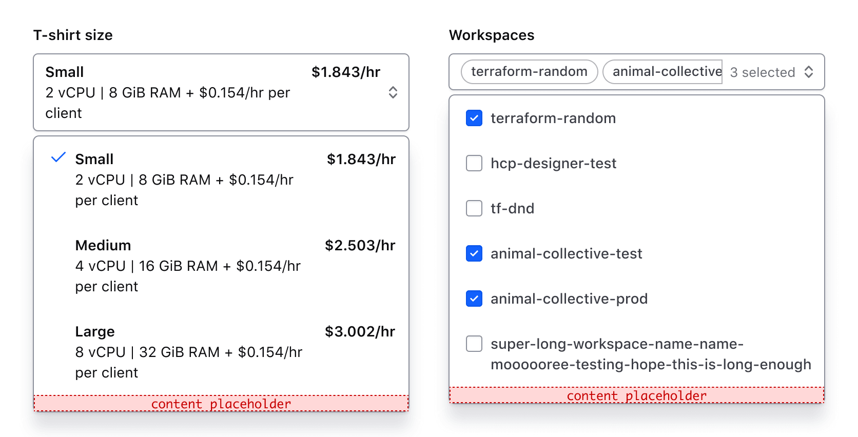
By default, all content of selected options displays in the “trigger”. Visually, this looks ok in SuperSelect::Single. However, in SuperSelect::Multiple the selected items are displayed as pill-shaped “tags” so can look quite busy.
<Hds::Form::SuperSelect::Multiple::Field
  @onChange={{fn (mut this.SELECTED_CLUSTER_SIZE_OPTIONS)}}
  @selected={{this.SELECTED_CLUSTER_SIZE_OPTIONS}}
  @options={{this.CLUSTER_SIZE_OPTIONS}}
  as |F|
>
  <F.Label>Size</F.Label>
  <F.Options>
    {{#let F.options as |option|}}
      <Hds::Text::Body @size="200">
        <div class="doc-super-select-option-rich-header">
          <strong>{{option.size}}</strong>
          <strong>{{option.price}}</strong>
        </div>
        <div>{{option.description}}</div>
      </Hds::Text::Body>
    {{/let}}
  </F.Options>
</Hds::Form::SuperSelect::Multiple::Field>
Selected item component
To simplify the content displayed in the selected options, use @selectedItemComponent to specify a custom component with only the content you wish to display.
An example of a custom selectedItemComponent example:
<span>
  {{@option.size}}
</span>
SuperSelect::Multiple invocation with selectedItemComponent specified:
<Hds::Form::SuperSelect::Multiple::Field
  @onChange={{fn (mut this.SELECTED_CLUSTER_SIZE_OPTIONS)}}
  @selected={{this.SELECTED_CLUSTER_SIZE_OPTIONS}}
  @selectedItemComponent={{component "power-select/selected-option-multiple"}}
  @options={{this.CLUSTER_SIZE_OPTIONS}}
  as |F|
>
  <F.Label>Size</F.Label>
  <F.Options>
    {{#let F.options as |option|}}
      <Hds::Text::Body @size="200">
        <div class="doc-super-select-option-rich-header">
          <strong>{{option.size}}</strong>
          <strong>{{option.price}}</strong>
        </div>
        <div>{{option.description}}</div>
      </Hds::Text::Body>
    {{/let}}
  </F.Options>
</Hds::Form::SuperSelect::Multiple::Field>
SuperSelect::Single invocation with selectedItemComponent specified:
<Hds::Form::SuperSelect::Single::Field
  @onChange={{fn (mut this.SELECTED_CLUSTER_SIZE_OPTION)}}
  @selected={{this.SELECTED_CLUSTER_SIZE_OPTION}}
  @selectedItemComponent={{component "power-select/selected-option-single"}}
  @options={{this.CLUSTER_SIZE_OPTIONS}}
  as |F|
>
  <F.Label>Size</F.Label>
  <F.Options>
    {{#let F.options as |option|}}
      <Hds::Text::Body @size="200">
        <div class="doc-super-select-option-rich-header">
          <strong>{{option.size}}</strong>
          <strong>{{option.price}}</strong>
        </div>
        <div>{{option.description}}</div>
      </Hds::Text::Body>
    {{/let}}
  </F.Options>
</Hds::Form::SuperSelect::Single::Field>
Limiting width
If needed, you can use dropdownMaxWidth to limit the width of the dropdown content. Setting a value for dropdownMaxWidth automatically sets matchTriggerWidth to false meaning that the width of the dropdown content will not necessarily match the list of the toggle or trigger element as it does by default.
<div class="doc-super-select-constrain-width">
  <Hds::Form::SuperSelect::Single::Field
    @onChange={{fn (mut this.SELECTED_LONG_OPTION)}}
    @selected="API code"
    @options={{this.LONG_OPTIONS}}
    @dropdownMaxWidth="25em"
    as |F|
  >
    <F.Label>Choose one</F.Label>
    <F.Options>{{F.options}}</F.Options>
  </Hds::Form::SuperSelect::Single::Field>
</div>
Helper text
You can add extra information to the field using Helper Text. When helper text is added, the component automatically adds an aria-describedby attribute to the Super Select control, associating it with the automatically generated ID of the helper text element.
<Hds::Form::SuperSelect::Single::Field
  @onChange={{fn (mut this.SELECTED_GROUPED_OPTION)}}
  @selected={{this.SELECTED_GROUPED_OPTION}}
  @options={{this.GROUPED_OPTIONS}}
  @ariaLabel="Label"
  as |F|
>
  <F.Label>Target infrastructure</F.Label>
  <F.HelperText>The target infrastructure is where you want to deploy your apps.</F.HelperText>
  <F.Options>{{F.options}}</F.Options>
</Hds::Form::SuperSelect::Single::Field>
Extra content in label and helper text
The Label and HelperText contextual components used in the Field component yield their content. This means you can also pass structured content.
For example:
<Hds::Form::SuperSelect::Single::Field
  @onChange={{fn (mut this.EXTRA_SELECTED_GROUPED_OPTION)}}
  @selected={{this.EXTRA_SELECTED_GROUPED_OPTION}}
  @options={{this.GROUPED_OPTIONS}}
  @ariaLabel="Label"
  as |F|
>
  <F.Label>Target infrastructure <Hds::Badge @size="small" @text="Beta" /></F.Label>
  <F.HelperText>This is an experimental feature (<Hds::Link::Inline @href="#">read more</Hds::Link::Inline>).</F.HelperText>
  <F.Options>{{F.options}}</F.Options>
</Hds::Form::SuperSelect::Single::Field>
Required vs. optional
Use the @isRequired and @isOptional arguments to add a visual indication that the field is "required" or "optional".